
Pell & Orchard
Year
2024
Client
Pell & Orchard Preserves
Project Type
Packaging design
The problem
Pell & Orchard had fourteen preserves and fourteen labels, each set by hand as the fruit came in. No two matched, the printer re-quoted every run, and a new flavour took a fortnight to reach the jar.
What we made
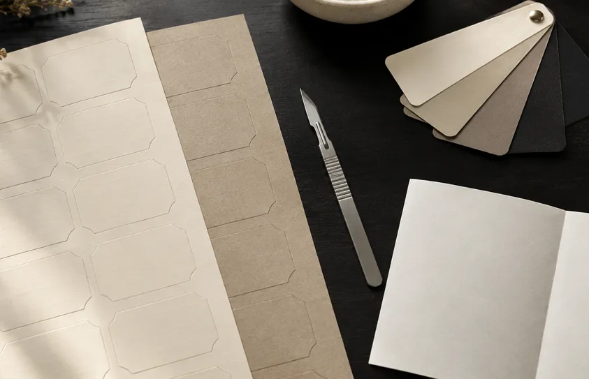
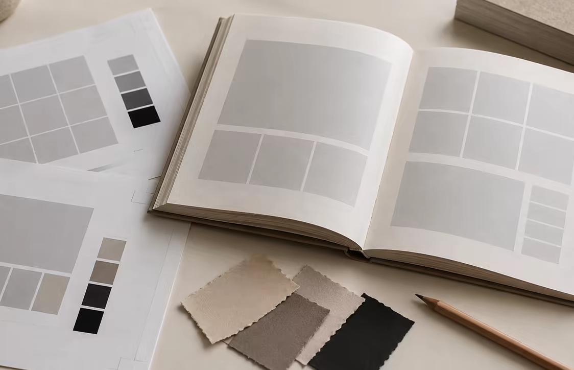
One label grid that takes any fruit name at any length, a colour rule that follows the season rather than the flavour, a waxed-cloth lid spec, and a dieline pack priced once for the whole range. The kitchen fills in a template; we are not in the loop.
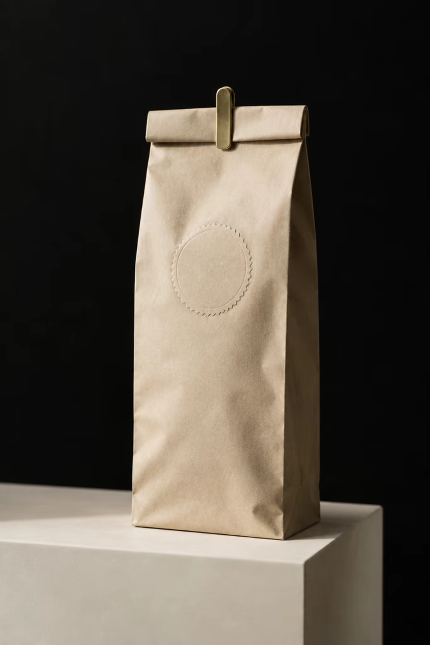
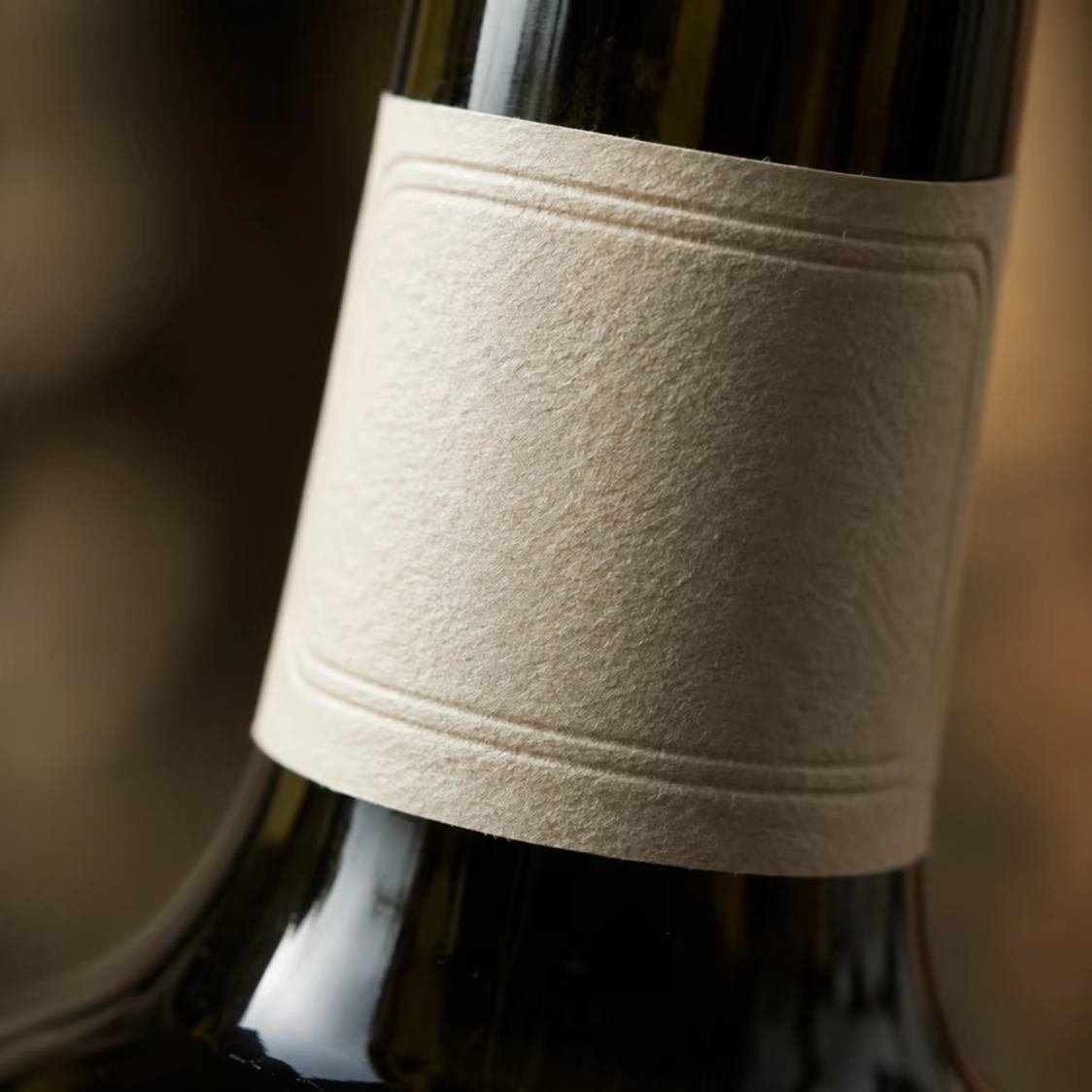
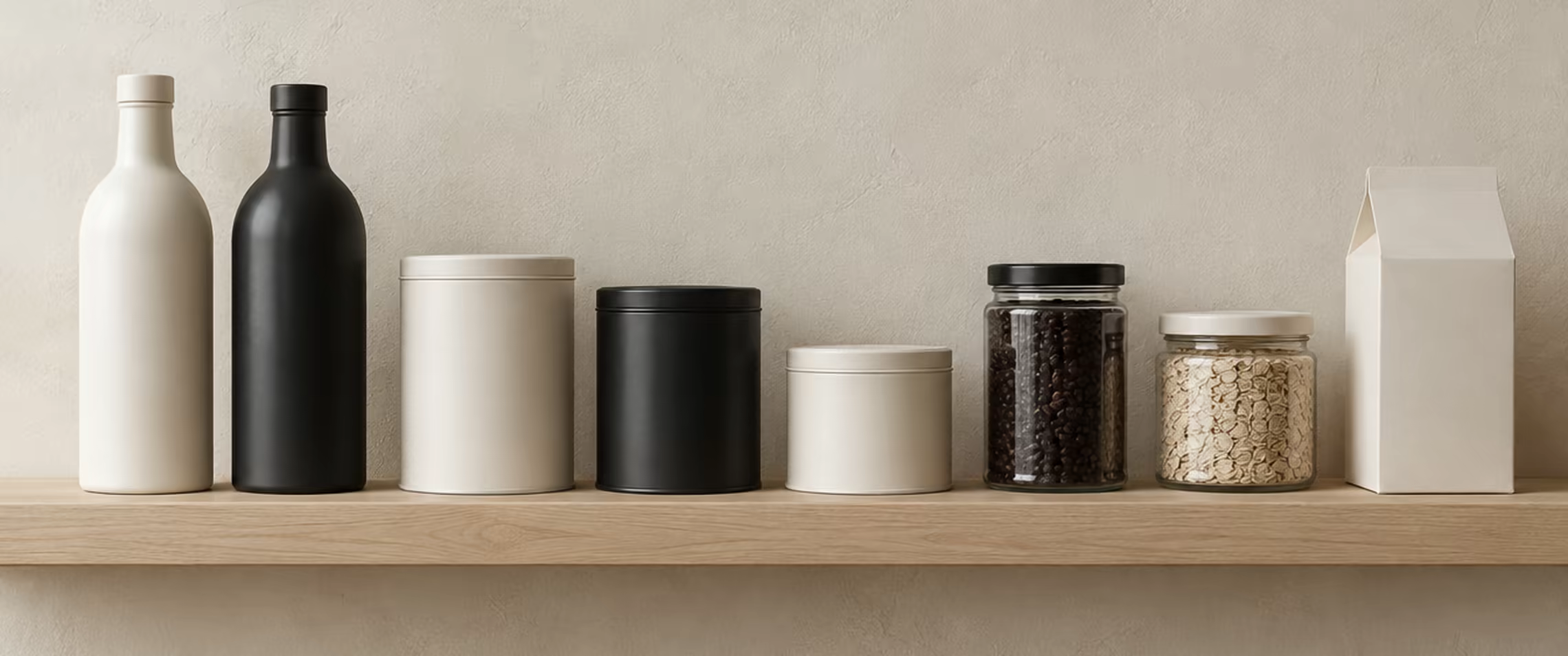
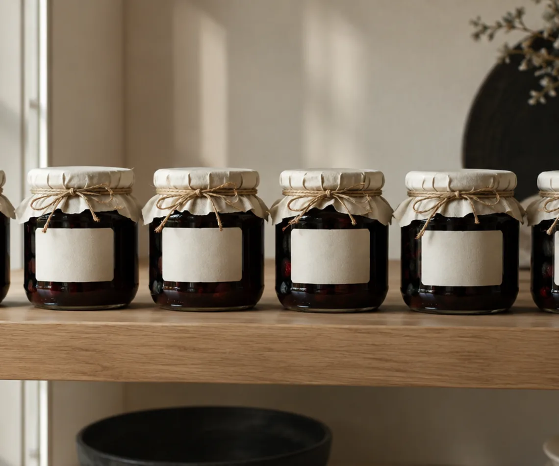
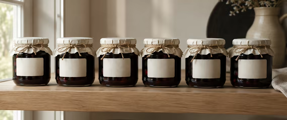
Fourteen jars that finally look like they came from one kitchen.
The result
Label artwork goes to print in a day instead of a fortnight. The full range sits together on a farm-shop shelf and reads as one maker, which is what the buyer asked for before taking it.